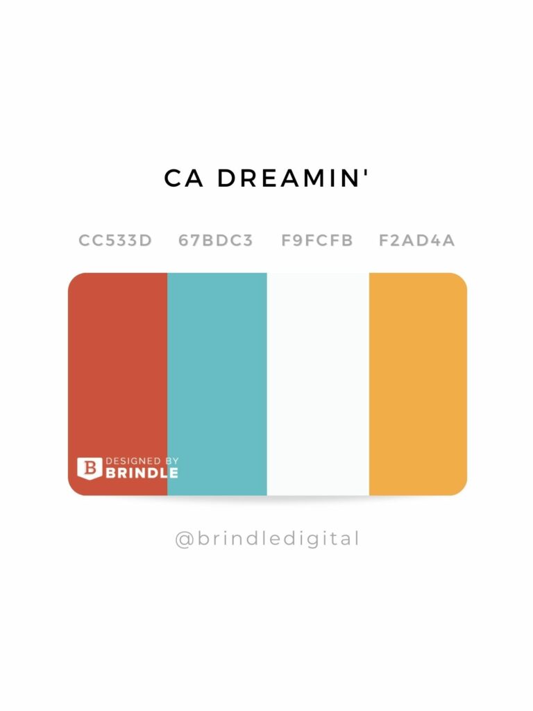
Choosing the Perfect Color Palette: A Step-by-Step Guide for Your Website
Choosing the perfect color palette for your website is essential for establishing a strong brand identity and enhancing user experience. A well-thought-out color scheme can evoke specific emotions and drive user engagement. Step 1: Begin by identifying the personality of your brand. Consider whether you want to convey a sense of professionalism, creativity, or warmth. Next, explore color psychology to understand the emotions different colors can evoke.
Step 2: After determining your brand's personality, create a mood board to visualize potential color combinations. Tools like Adobe Color or Coolors can help generate harmonious color palettes. Once you have a few options, test them on your website to see how they affect user interactions. Remember, consistency is key; sticking to your chosen palette across all pages helps reinforce your brand identity.
The Psychology of Color: How to Use Colors to Enhance User Experience
The psychology of color plays a crucial role in shaping user experience across various platforms, from websites to applications. Colors evoke emotions and convey messages, influencing how users perceive a brand or product. For instance, blue often evokes feelings of trust and dependability, making it a popular choice for financial institutions. In contrast, red can generate excitement and urgency, which works effectively for sales and clearance promotions. Understanding these emotional triggers can help designers strategically select colors that resonate with their target audience.
To leverage the psychology of color effectively, consider the following tips:
- Identify Your Brand Personality: Choose colors that reflect your brand's values and message.
- A/B Testing: Experiment with different color schemes to see which one resonates more with your users.
- Ensure Accessibility: Use color combinations that are accessible to individuals with visual impairments to enhance overall user experience.
5 Common Color Palette Mistakes and How to Avoid Them
Choosing the right color palette for your design can significantly influence the overall aesthetics and functionality of your project. However, many people make mistakes when selecting colors, leading to unappealing designs. Here are 5 common color palette mistakes to watch out for:
- Ignoring Color Theory: Failing to understand the fundamentals of color theory can lead to mismatched colors. Ensure you are familiar with concepts like complementary and analogous colors.
- Overusing Colors: Using too many colors can create a chaotic look. It's often best to stick with a primary color alongside one or two accent colors.
To avoid these pitfalls, consider the following tips:
- Neglecting Brand Identity: Your color choices should reflect your brand's identity. Always keep your brand colors in mind when selecting a palette.
- Lack of Consistency: Inconsistent color usage can confuse users. Maintain uniformity across all design elements for a cohesive look.
- Forgetting Accessibility: Ensure that your color palette is accessible to all users, including those with visual impairments. Opt for high contrast between text and background colors.